Earlier on in the academic year our tutor had giver us detailed lessons on how to create our individual parts of the coursework (the magazine cover and homepage for a website). We had been taught how to use Adobe Photoshop to create both the poster and homepage as well as Macromedia Dreamweaver -which we would use to broadcast our homepages live on the internet. Therefore when it came around to actually making our film posters and website homepages for real, we were reasonably prepared.
First I had to decide which magazine I would like to design a cover for. I decided in the end to design for
Sight & Sound magazine as I was already familiar with it, having design my example magazine cover for them (
see previous blog). Also, I didn't think many people would choose to design for
Sight & Sound, opting instead for Empire. I began the design process by choosing which image I wanted to use as the main cover image.
Sight & Sound's image and style is very iconic and they more than often do a photoshoot with the star or icon on the cover, rather than choosing a still or screengram from the movie they are representing. I did consider the idea of doing a photoshoot with Lloyd, my helpful actor, however in the end thought that just a simple image of just him would be a bit dull. I therefore decided to use a photograph that I thought would be appropriate (one of the photo's I had taken on the day of filming) and set that as the main image, and background of my magazine cover. To do this I had to find out the measurements of a
Sight & Sound magazine (I did this by going to the college library and taking several measurements myself, and then set these measurements as the dimensions for the canvas I would be working on on Photoshop. The image showed Lloyd (who plays Ethan) sat between the two posts -of 'two-post' beach near Sandfoot beach and the castle- with a pensive expression on his face. The only probably that occurred using this image was that the photograph was taken in Landscape format and I needed it to be portrait (as all magazine covers are). I resolved this by cropping the photo and then dragging it onto the canvas where I resized it so that it fit reasonably well. After the main image and background was sorted for my cover, I then needed to look at and apply all the vital elements that occurred on the covers of
Sight & Sound magazine -meaning the
Sight & Sound logo and the BFI logo with barcode and date written on it (both of these are on a yellow background). I did this by cutting the logos off of the
Sight & Sound cover I had opened up into Photoshop, then copying them onto my canvas (with the background still on it) and resizing them so that they were the same scale as the authentic logos, making my magazine look as realistic as possible.
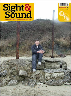
(My magazine cover so far: the image I am using and
Sight and Sound's most recent logo/titles).
I then needed to add the titles and text I wanted to the cover. I began with the main title, which i wanted to be a pun of the film itself; The Cove. Because it was a focal feature of the cover I wanted to give it an interesting font that would make it stand out and that was suitable to the content on the film. I chose to use the font 'DuewTWOo'from the website www.dafont.com. The result looked really good and stood out well against the background and so I decided to add some of the other text in the same font as well. However because this text was smaller than the title of the cover the text did not look quite so good, in fact it was barely legible against the also dark background. To resolve this I tried putting a white outline around the black text to make it stand out more which worked really well. I did this on Photoshop by: selecting the text with the 'magnetic magic wand tool', then double clicking on the piece of texts 'layer', selecting the 'outer glow' option, and changing the colour of the glow to white, then altering the 'opacity', 'noise', 'spread' and 'size' until the text was the way I wanted it. I did this for the whole piece of text and then did the title 'The Cove' to match. When I had finished my cover looked like this:

(Shows my cover with the title 'The Cove' and relavant text below it. Font used: 'DuerTWOo' from font website
dafont).
After this I added a 'Plus' feature, which I noticed occurred on many of the magazine covers I had researched into (see previous blog). I then thought of which other kind of features Sight and Sound magazine might use on their professional covers and added several of those to the feature. They were: a behind the scenes article about Martin Scorsese's Shutter Island, an article about the rise to fame of Aaron Johnson and an article about the rise of Scandinavian film. Sight and Sound also used a very specific font type for this 'Plus' feature that looked quite cartoon-ish and playful, almost like bubble writing (see previous blog again). So I made use of www.dafont.com once more and found the most similar font I could 'Starguides'. This font also needed some adjusting once I put it against my background because it became hard to read and so I added a 'drop shadow' to both the text and the 'Plus'. I did this by: selecting the text with the 'magic magnetic wand tool', then double clicking on the piece of texts 'layer', selecting the 'drop shadow' option and then adjusting the distance, spread and size until it looked the way I wanted it too. I did face a problem however after I realised that the drop shadow on the text of the feature was a little bit too dark and heavy. However when I tried to change it and make it lighter, I couldn't because it had reset itself to '0'. I tried to go back into my history as well however to much time had passed and it had already been deleted, meaning that I had to stick with what I had done in the first place. This was the result: 
(My magazine cover with the additional text in 'Starguides' font, front website dafont).
I knew I needed to add more to the cover because it looked slightly blank and I wasn't entirely happy with it. I therefore researched more into Sight and Sound covers to see what I could add. Eventually I settled on adding an 'Every New Film Reviewed' sticker type feature, because it featured frequently on many of the covers.


 The day of filming went well. We split the filming into two days, because parts of filming were very different from others. For instance the interview scenes had to be done in a quite room preferrably with white walls where as all other scenes all had to be shot outside -at castle cove beach and in surrounding areas- and at one of our homes. We left straight after our class on the Wednesday morning and began filming the outside scenes on the beach and the house scenes. We needed three shots for the house scenes, which were easy to do. The first shot was a panning shot of the protaganist coming around

 After we had filmed the house scenes, we needed to film the slightly more difficult outdoor scenes. We made our way down to Three-posts beach and the cove at mid day and began filming in the horrible pre-sping Weymouth weather. The first shot we needed was an establishing, panning shot of the the beach where we would be filming, that would set the scene for the audience. The second was of our protaganist running along the beach, then stumbling and falling over, and then getting back to his feet and running out of shot. Other shots included: a shot of a dead body washed up on the shore, drenched though and covered in seaweed, tracking shots of Ethan running frantically across the beach and through grass, and a POV shot of Ethan face looking through the bushes and his terrified eyes. After our day of filming was complete (we ended up finishing at about half past three in the afternoon), we were confindent with what we had achieved and that we had all the shots we would need.


 The following day we needed to film the interview shots, which showed Ethan reliving and retelling his experiences. We needed nine of these interview clips that would fit inbetween the other action clips. We therefore hired out the filming and camera equiptment again, and found a suitable room -I had imagened a plain room with bright, white walls as the setting to give a real interview/interrigation feel -but in the end we settled for a projection backdrop. These shots were very simple to film asd they obviously required know movement or much altering at all, the camera stayed in one place the whole time. The only problems were the acting -as sometimes, naturally, Lloyd (acting Ethan's role) would mess up his lines, and the quality of the sound, as sometimes we would get unwanted sound effects such as cars driving past outside or people in thje next rooms talking.
