Friday, 30 April 2010
Journal
Evaluation
Some months later, when it came to developing these initial ideas and putting our skills into use, we were prepared and had a fairly clear idea of what we needed to do. We began the long filmmaking process by developing our ideas for the film. We had decided that we wanted to make a thriller genred film, and had come up with several ideas and names previously that we could develop. We soon decided upon the idea of a troubled young man who goes to escape to his uncle’s home in the Dorset countryside. After a few days at his uncles secluded home on the beach, he decides to take the dog out for a walk, upon this walk however, he comes across a dead body washed up on the shore. As the story develops a hidden crime-ring is discovered, revealing the deaths and cover ups of dozens of foreign immigrants. We decided to call it: Castle Cove. We developed Castle Cove into a more fully realised idea, created the scripts and storyboards and began our research, getting all of the necessary paperwork sorted ready for production. During this time however we found some problems with our idea, noticing details that weren’t very realistic for us to film. We changed and developed the initial idea for so long that time was getting short, and so we were forced to change out idea for the last time. Our final idea became an interview session: one half on the trailer would be our lead protagonist –who we named Ethan- being interview about the traumatic events he went through, -talking in the past tense to the camera, while the other half –which would we cut and edited in between the interview shots, as Ethan explained the events- were of the events he is describing, such as seeing the dead body, being chased, seeing his home being broken into, etc. The effect that we were after was that of Ethan explaining the events in the past tense, then there being flash backs to the said event. Although the idea wasn’t our initial one, it still worked really well with our genre of thriller and what we had in mind.
In what ways does you media product use, develop or challenge forms and conventions of real media products?
Thursday, 29 April 2010
Trailer
The trailer was the main, and most important task of the coursework, and took the most time to create as expected. From the initial ideas stage all those months ago, throught to the planing and pre-production, and then the filming and finally the editing, the whole process took a good couple of months. From what we sent out to do and the initial ideas we originally had, I think our end product has changed a lot. Despite this I am still really please with what we have managed to achieve, through out all the up's and down's our group faced. I think our trailer for fills it's genre requirements and we applied the codes and conventions we needed too and I think our trailer is as convincing as a real advertising product for a film.
Friday, 23 April 2010
Radio Advertisment
Website Homepage

Below is my final design opened up onto a web browser (simply click it and it becomes a full sized image, as if it were a real website homepage). Once I had created my design on Photoshop I went through Macromedia Dreamweaver to open the page up as if it were broadcasted live on the internet.

Creating the Website Homepage
I began by setting the canvas to 600 x 800 and opening up the image I wanted to use as my background. I chose to use the same photograph for my homepage as I used for my magazine cover because I wanted them to be the same as both are part of the same advertising campaign and in my opinion should be as similar as possible so that this is obvious. On top of this background I added the text 'Castle Cove' in the same font as I had used for the title on the magazine cover; 'DuerTWOo' by www.dafont.com. These two elements; the background image and the title, were the only two things I took from the magazine cover. After this I wanted to add the actors name, Lloyd Naerger, above the title of the film. After this I decided to add a 'fish eye' effect frame, I wanted to give the effect that the darkness was creeping in, upon Ethan. The line around the circle was very clear and obvious, however I wanted it to be blurred, the black getting less dense at it reaches the image, almost fading in. I therefore had to use the 'outer glow' feature in the 'blending options' to blend the sharp line so that it faded into the image. This is what my homepage looked like:
 (Homepage so far: showing main image and background, title of the film and main cast).
 (Homepage: showing a date of release, several relevent links, credits, an age certificate and links to pages on Facebook and Twitter).
 All that was left to do to complete my homepage was add the video of our trailer to the page and a tagline.
My finished Magazine Cover

Wednesday, 21 April 2010
Website Homepage Research


Magazine Cover Research


Friday, 16 April 2010
Creating the Magazine Cover
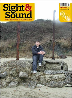
First I had to decide which magazine I would like to design a cover for. I decided in the end to design for Sight & Sound magazine as I was already familiar with it, having design my example magazine cover for them (see previous blog). Also, I didn't think many people would choose to design for Sight & Sound, opting instead for Empire. I began the design process by choosing which image I wanted to use as the main cover image. Sight & Sound's image and style is very iconic and they more than often do a photoshoot with the star or icon on the cover, rather than choosing a still or screengram from the movie they are representing. I did consider the idea of doing a photoshoot with Lloyd, my helpful actor, however in the end thought that just a simple image of just him would be a bit dull. I therefore decided to use a photograph that I thought would be appropriate (one of the photo's I had taken on the day of filming) and set that as the main image, and background of my magazine cover. To do this I had to find out the measurements of a Sight & Sound magazine (I did this by going to the college library and taking several measurements myself, and then set these measurements as the dimensions for the canvas I would be working on on Photoshop. The image showed Lloyd (who plays Ethan) sat between the two posts -of 'two-post' beach near Sandfoot beach and the castle- with a pensive expression on his face. The only probably that occurred using this image was that the photograph was taken in Landscape format and I needed it to be portrait (as all magazine covers are). I resolved this by cropping the photo and then dragging it onto the canvas where I resized it so that it fit reasonably well. After the main image and background was sorted for my cover, I then needed to look at and apply all the vital elements that occurred on the covers of Sight & Sound magazine -meaning the Sight & Sound logo and the BFI logo with barcode and date written on it (both of these are on a yellow background). I did this by cutting the logos off of the Sight & Sound cover I had opened up into Photoshop, then copying them onto my canvas (with the background still on it) and resizing them so that they were the same scale as the authentic logos, making my magazine look as realistic as possible.
 (My magazine cover so far: the image I am using and Sight and Sound's most recent logo/titles).
I then needed to add the titles and text I wanted to the cover. I began with the main title, which i wanted to be a pun of the film itself; The Cove. Because it was a focal feature of the cover I wanted to give it an interesting font that would make it stand out and that was suitable to the content on the film. I chose to use the font 'DuewTWOo'from the website www.dafont.com. The result looked really good and stood out well against the background and so I decided to add some of the other text in the same font as well. However because this text was smaller than the title of the cover the text did not look quite so good, in fact it was barely legible against the also dark background. To resolve this I tried putting a white outline around the black text to make it stand out more which worked really well. I did this on Photoshop by: selecting the text with the 'magnetic magic wand tool', then double clicking on the piece of texts 'layer', selecting the 'outer glow' option, and changing the colour of the glow to white, then altering the 'opacity', 'noise', 'spread' and 'size' until the text was the way I wanted it. I did this for the whole piece of text and then did the title 'The Cove' to match. When I had finished my cover looked like this:
 (Shows my cover with the title 'The Cove' and relavant text below it. Font used: 'DuerTWOo' from font website dafont).
After this I added a 'Plus' feature, which I noticed occurred on many of the magazine covers I had researched into (see previous blog). I then thought of which other kind of features Sight and Sound magazine might use on their professional covers and added several of those to the feature. They were: a behind the scenes article about Martin Scorsese's Shutter Island, an article about the rise to fame of Aaron Johnson and an article about the rise of Scandinavian film. Sight and Sound also used a very specific font type for this 'Plus' feature that looked quite cartoon-ish and playful, almost like bubble writing (see previous blog again). So I made use of www.dafont.com once more and found the most similar font I could 'Starguides'. This font also needed some adjusting once I put it against my background because it became hard to read and so I added a 'drop shadow' to both the text and the 'Plus'. I did this by: selecting the text with the 'magic magnetic wand tool', then double clicking on the piece of texts 'layer', selecting the 'drop shadow' option and then adjusting the distance, spread and size until it looked the way I wanted it too. I did face a problem however after I realised that the drop shadow on the text of the feature was a little bit too dark and heavy. However when I tried to change it and make it lighter, I couldn't because it had reset itself to '0'. I tried to go back into my history as well however to much time had passed and it had already been deleted, meaning that I had to stick with what I had done in the first place. This was the result: 
(My magazine cover with the additional text in 'Starguides' font, front website dafont).
I knew I needed to add more to the cover because it looked slightly blank and I wasn't entirely happy with it. I therefore researched more into Sight and Sound covers to see what I could add. Eventually I settled on adding an 'Every New Film Reviewed' sticker type feature, because it featured frequently on many of the covers.
Editing the trailer
Tuesday, 23 March 2010
Day of filming

 The day of filming went well. We split the filming into two days, because parts of filming were very different from others. For instance the interview scenes had to be done in a quite room preferrably with white walls where as all other scenes all had to be shot outside -at castle cove beach and in surrounding areas- and at one of our homes. We left straight after our class on the Wednesday morning and began filming the outside scenes on the beach and the house scenes. We needed three shots for the house scenes, which were easy to do. The first shot was a panning shot of the protaganist coming around the corner, through his front gate and to his door, the second was an over the shoulder shot of him approaching the door (that is already ajar) and pushing it slightly to reveal that it is unlocked and the last was of our protaganist looking around the ground floor of the house and then running up the stairs.

 After we had filmed the house scenes, we needed to film the slightly more difficult outdoor scenes. We made our way down to Three-posts beach and the cove at mid day and began filming in the horrible pre-sping Weymouth weather. The first shot we needed was an establishing, panning shot of the the beach where we would be filming, that would set the scene for the audience. The second was of our protaganist running along the beach, then stumbling and falling over, and then getting back to his feet and running out of shot. Other shots included: a shot of a dead body washed up on the shore, drenched though and covered in seaweed, tracking shots of Ethan running frantically across the beach and through grass, and a POV shot of Ethan face looking through the bushes and his terrified eyes. After our day of filming was complete (we ended up finishing at about half past three in the afternoon), we were confindent with what we had achieved and that we had all the shots we would need.


 The following day we needed to film the interview shots, which showed Ethan reliving and retelling his experiences. We needed nine of these interview clips that would fit inbetween the other action clips. We therefore hired out the filming and camera equiptment again, and found a suitable room -I had imagened a plain room with bright, white walls as the setting to give a real interview/interrigation feel -but in the end we settled for a projection backdrop. These shots were very simple to film asd they obviously required know movement or much altering at all, the camera stayed in one place the whole time. The only problems were the acting -as sometimes, naturally, Lloyd (acting Ethan's role) would mess up his lines, and the quality of the sound, as sometimes we would get unwanted sound effects such as cars driving past outside or people in thje next rooms talking.
All in all I feel the filming went quite well and we got all of the shots we planned and needed to get in the two days we had planned and we didn't need to go back and reshoot anything.
Wednesday, 17 March 2010
Coursework progress update (trailer)
Monday, 1 March 2010
Coursework progress update (trailer)
Tuesday, 9 February 2010
Coursework progress
Monday, 25 January 2010
Updated notes on: where my skills are currently at, where i'd like to develope them to and what i'll need to do in order for it to happen
In class we were taught the basics of programmes we would need to know how to use, and reasonably well, in order to complete certain aspects of our coursework. We were shown how to use Adobe Photoshop to create a professional looking magazine front cover and a web page for a fictitious film we had created as a group. We were also taught how to use a more complicated programme called Macromedia Dream Weaver, which allowed us to broadcast our web homepages live on the Internet. It was very important that we paid attention and learning how to use both of these programmes well, as we would be designing the magazine front covers and homepages individually, instead of as a group.
Having had some experience with Photoshop before, I was familiar with the programme, however needed a bit of a reminded of some of the features. I found making the magazine cover quite straight forward, although the finish result was very basic. I am very determined however to improve my skills on Photoshop before the time comes to make the real thing because although my attempt at the cover was good, there is still room for improvement. Creating the homepage however was a lot more difficult than making our magazine covers had been, simply because the process was slightly more complicated and involved more steps. We had to put together a webpage on Photoshop (similar to what we had done with our front covers), by doing this it would mean that the screen shown would be saved separately. Using Photoshop was only half of the task however, for the second part we were asked to use Macromedia Dream Weaver, a programme that I had never used before. This was the programme that would allow us to broadcast our webpage’s live on the internet. The programme was quite complicated and we had to follow all the steps accurately to get it right. I am currently not very confident with using Dream Weaver as it is such a complicated programme. To improve I will need to revise the notes I made and practice making another homepage and broadcasting it on the internet. In time for making our covers and homepages I would like to know exactly what I’m doing on both Photoshop and Dream Weaver and know how to use them well, resulting in a professional outcome. Practice makes perfect.
(My finish magazine cover for publication ‘Dazed and Confused’ can be seen in my fifth blog. My original notes on using Adobe Photoshop and Macromedia Dream Weaver can be found in my third and fourth).
Tuesday, 5 January 2010
A2 Media Studies; Media & Collective Identity, Christmas Homework 2009
1. Blogger: First and foremost, the obvious website that allows readers/users/contributors to create or participate in a collective identity is Blogger, a site we have been using for months now as a method of interactively posting our coursework and progress online. Blogs and blogging is a great way of getting comments or feedback back from a thought, opinion, idea –anything someone might want to post as a blog. It allows members of a blogging site or followers of a blog –it’s readers/users/contributors- to contribute and participate in a blog.
The collective identity is constructed by the blogger, who publishes the blog, and the people who reply to it. It is a common interest on both of their parts that makes up the identity. They share the same interest –the subject of a certain blog- or indeed blogging in general- and that is how that certain collective identity is constructed.
Blogging sites are possibly the best example of websites that allow readers and users to contribute to not only their own pages and blogs, but others too. Blogs are often regularly used to ask questions or make enquires, allowing for answers from as many people that choose to answer. I often type questions into Google search engine hoping for an outcome and am led to a blog conversation where a similar or the same question has been answered, which lots of replies from people who have answered the bloggers' query. This brings me onto more subjective blogging groups and sites. People often make blogs or entire blogging sites about one particular subject, so that all the members that join are all interested in that certain subject, whatever it may be, and they have many blog conversations about different things involving that subject. Some examples of these more selective blogging groups could include: bands, groups and musical artists, visual artists, films or film series (eg. Star Wars or the Indiana Jones film series), or indeed television programmes or series (eg. Doctor Who or Merlin), the blogging room discussions go on and on. Blog chats such as these are an example of more individual, subjective collective identities, compared to the more general blog users. The individuals that join and are users on certain blogging chats or subjects have a very clear collective identity and identity in common and are all interested in that same thing, giving them a collective identity as a group of blog users that are interested in a specific topic or subject.
Link to my Blogger Homepage
Link to my Blogger Blogs
2. Myspace: The obvious websites that came to mind, upon reading the task set, were the many Social Networking sites that preoccupy so many of us. The one I personally am a member of is Facebook; one of the most popular of these Networking websites. However this is not the one in particular that I found best allowed it’s members -it’s readers/users/contributors- to create or participate in a collective identity, the one that in my opinion best allows this is Myspace.
Each Social Networking site appeals to, and attracts, a certain group of people- a certain collective identity. This is not an intentional occurrence on the sites part, but these groups of people begin to ‘own’ the site they use, simply because that collective identity is the majority of the people that use it. For example I have found that Bebo is widely associated with ‘chavs’ and generally adolescence and younger people rather than adults. Myspace is widely occupied by ‘scene kids’, ‘emo kids’ and ‘indie kids’, again mostly younger, however there are still many older users, where as Facebook seems to be used by a much more varied audience. Adults and older people seem to prefer using this Social Networking site above the other for which ever reason, and they make up the vast majority of the users. There is no obvious reason I can think of that explains why certain groups of people or collective identities choose certain sites over others. The only link I have made refers back to Myspace. Myspace is very famous for it’s promotion of music and bands, it allows known, and unknown bands to advertise themselves and their music for free, and allows Myspace users to find and listen to their music, also free of change. It is a suggestion that this is the reason the majority of Myspace users are the younger stereotypes stated above -‘emos’, ‘scene kids’, ‘goths’, ‘indie kids’, etc- because they are perhaps more interested in finding and listening to new and upcoming artists and music, and again specific types/genres of music, than Bebo users and Facebook users.
Myspace stands out amongst the other Social Networking sites in the sense that it allows its participants or members to reveal more information about themselves than any of the others I have come across. It is unique in the way that it has so many different sections in which to fill out about yourself. From more general subjects like: About Me and Who I’d like to meet, to more focused topics like the individuals interests: General, Music, Movies, Books and last and but defiantly not least; Heroes. All of these sections give an individual the opportunity to write about themselves, talk about themselves, maybe even lie about themselves if they so choose. (And what’s to say that that majority of people filling in these sections are not lying about themselves to whoever might observe their page? Or at the very least exaggerate or ‘big-themselves-up’).
Apart from the ‘Blurbs’ and ‘Interests’ that hit you as soon as you open the persons page there is a section named ‘Basic Information’ where the user can add personal details such as their name, what gender they are, their date of birth, and their address down to the post-code. However if you think that’s personal, move along to the next box titled ‘Details’. In this section the individual can edit their marital Status, sexual orientation, hometown, height, body type, ethnicity and their religion. As well as information on whether they smoke or drink, have children and their education, occupation and income, information that’s is personal and private and maybe should not should not be shared with your entire ‘friends’ list. Last but not least we have the ‘Pictures’ and ‘Videos’ section of the profile, where the member can post any image or video they may choose –within reason- exposing themselves to the world (again, if that is really who they are).
The reason I chose to analyse Myspace over the other Social Networking sites out there is because it puts this information; the Blurbs, the About Me’s, the Interests –the person’s personality- out there on the front line unlike any other does. When you click on someone’s page it is the first thing you see, what that person has chose, or rather allowed, you to see.
Link to my own Myspace page
3. Youtube: Youtube is another website the allows it’s users to contribute, participate and feedback interactivly, however in a different way than any Socail Networking sites or blogging sites do. Instead of using words to feed back to, Youtube is a video sharing website which allows users to upload and share videos, and also comment and feedback on fellow uploaders videos, too. The sites is used for many things, however many people use it for purely entertainment purposes, uploading videos they have made themselves. It is not only members that can view the videos available on Youtube although you do need to be a member to upload your own or feedback on others.
My only experience with Youtube has been to upload AS Media Studies coursework, so that it could be viewed by an examiner interactivly. Apart from this breif encounter however I have only used the site to view other users videos, like the majority of the people who use Youtube.
Link to my priliminary AS Media coursework exercise
Link on my main AS Media coursework exercise
